Artwork request - Encyclopedia Logo
Pages
| Author | Topic: Artwork request - Encyclopedia Logo |
|---|---|
|
Law Bringer
Member # 2984
|
written Thursday, September 28 2006 12:57
Profile
Homepage
The last time I mentioned this, it got buried in other stuff, so here it is again: I tore out the previous logo of the Encyclopedia Ermariana a while ago. It was made in five minutes, used artwork that may be copyrighted (off Google Images), and it didn't really fit the project (I'd actually intended it as a placeholder in the first place). Now with the host move, software upgrade and other things taken care of, the generic [[Flower]] icon for MediaWiki is looking a bit out of place. I know that creative and artistically skilled people are in abundance here, so I'd like to know if anyone feels like making something. :) The picture should be between 135x135px and 150x150px large to fit in the space (look at the images I linked for examples), and should be proportioned to roughly fit in a square/circle, to avoid looking awkward. Color scheme and content is up to your imagination, but it should preferably be something characteristic for Ermarian/the E&A series. Needless to say, it must not be derived from copyrighted art - although your copyright to it will remain intact, and you'll be credited on the site. I could offer different things in return, for example a subdomain at *.ermarian.net, a corresponding email address, or even (for those who still haven't got one) a Gmail invite. Other things open for negotiation, although I'll have to draw the line at sensual massages. :P [ Thursday, September 28, 2006 12:58: Message edited by: Robert Daniel Oliver ] -------------------- Encyclopaedia Ermariana • Forum Archives • Forum Statistics • RSS [Topic / Forum] My Blog • Polaris • I eat novels for breakfast. Polaris is dead, long live Polaris. Look on my works, ye mighty, and despair. Posts: 8752 | Registered: Wednesday, May 14 2003 07:00 |
|
Shaper
Member # 73
|
written Thursday, September 28 2006 17:42
Profile
 100% original, if a bit shoddy. It's in GIF, but I can put it in a different format if you want. [ Friday, September 29, 2006 15:35: Message edited by: The Almighty Do-er of Stuff ] -------------------- My Myspace, with some of my audial and visual art The Lyceum - The Headquarters of the Blades designing community The Louvre - The Blades of Avernum graphics database Alexandria - The Blades of Exile Scenario database BoE Webring - Self explanatory Polaris - Free porn here Odd Todd - Fun for the unemployed (and everyone else too) They Might Be Giants - Four websites for one of the greatest bands in existance -------------------- 1 2 3 4 5 6 7 8 9 10 11 12 13 14 15 Posts: 2957 | Registered: Thursday, October 4 2001 07:00 |
|
Law Bringer
Member # 335
|
written Thursday, September 28 2006 19:49
Profile
Homepage
  —Alorael, who now has two variations, neither one of which he finds quite satisfying. That thing in the left hand needs work. [ Thursday, September 28, 2006 20:02: Message edited by: All My Canisters ] Posts: 14579 | Registered: Saturday, December 1 2001 08:00 |
|
Lack of Vision
Member # 2717
|
written Friday, September 29 2006 04:55
Profile
I know we're all suppposed to turn up our collective noses toward graphical sophistication, given our (mostly) collective appreciation for Spiderweb games, but SERIOUSLY. Is this best we, as a community of DIYSers, can do? Z  -------------------- Pan Lever: Seventeen apple roving mirror moiety. Of turned quorum jaggedly the. Blue? Posts: 186 | Registered: Thursday, February 27 2003 08:00 |
|
Cartographer
Member # 1851
|
written Friday, September 29 2006 06:10
Profile
Homepage
They could be worse. :\ I'd prove myself correct, but uh... I have to go away for the weekend and so someone else will probably do that for me. Or the opposite for, er.. Aran. -------------------- "I'm not crazy!" "Well, whatever. Maybe you just ate something really questionable, or perhaps someone hit you on the head with something large, blunt and heavy just now. By the way..." Gil nudged Grul pointedly. Ooh! Homepage - Blog - Geneforge, +2, +3 - My Elfwood Gallery and DevArt page So many strange ones around. Don't you think? Posts: 1308 | Registered: Sunday, September 8 2002 07:00 |
|
Agent
Member # 3364
|
written Friday, September 29 2006 07:28
Profile
Homepage
    I've always liked simple, yet elegnant. Not gonna get much better from me. -------------------- "Even the worst Terror from Hell can be transformed to a testimony from Heaven!" - Rev. David Wood 6\23\05 "Do all the good you can, by all the means you can, in all the ways you can, in all the places you can, at all the times you can, to all the people you can, as long as you ever can." - John Wesley Posts: 1001 | Registered: Tuesday, August 19 2003 07:00 |
|
Lifecrafter
Member # 6388
|
written Friday, September 29 2006 08:19
Profile
My suggestion, because I have neither the time nor the inclination to do it myself, would be a combination of the symbols of the human factions: sword through crown, sunburst. Posts: 794 | Registered: Tuesday, October 11 2005 07:00 |
|
Raven v. Writing Desk
Member # 261
|
written Friday, September 29 2006 10:04
Profile
Homepage
I'll second Alec's idea, though I wouldn't be opposed to including a Vahnatai symbol as well. EE starts with the games and there are three major powers in the games, after all. Alorael, I like your design but the magical whatever growing out of the left side hand doesn't work. At all. It looks like a combination comb/lava lamp. What is it supposed to be? -------------------- Slarty vs. Desk • Desk vs. Slarty • Timeline of Ermarian • G4 Strategy Central Posts: 3560 | Registered: Wednesday, November 7 2001 08:00 |
|
Shaper
Member # 73
|
written Friday, September 29 2006 10:58
Profile
quote:I don't see you offering anything. I might try to make something else too. -------------------- My Myspace, with some of my audial and visual art The Lyceum - The Headquarters of the Blades designing community The Louvre - The Blades of Avernum graphics database Alexandria - The Blades of Exile Scenario database BoE Webring - Self explanatory Polaris - Free porn here Odd Todd - Fun for the unemployed (and everyone else too) They Might Be Giants - Four websites for one of the greatest bands in existance -------------------- 1 2 3 4 5 6 7 8 9 10 11 12 13 14 15 Posts: 2957 | Registered: Thursday, October 4 2001 07:00 |
|
Agent
Member # 1934
|
written Friday, September 29 2006 11:33
Profile
Homepage
Here's what paint and half an hour can do:  -------------------- You acquire an item: Radio Free Foil Posts: 1169 | Registered: Monday, September 23 2002 07:00 |
|
Councilor
Member # 6600
|
written Friday, September 29 2006 11:35
Profile
Homepage
 Dikiyoba has nothing to say about this submission. It is what it is and isn't what it isn't. Posts: 4346 | Registered: Friday, December 23 2005 08:00 |
|
Law Bringer
Member # 335
|
written Friday, September 29 2006 11:37
Profile
Homepage
 So much for magical things. Now the vahnatai gets a waveblade and the title gets plain old E's. —Alorael, who has noticed that his logo is not very logo-like. Thoughts? Posts: 14579 | Registered: Saturday, December 1 2001 08:00 |
|
Shaper
Member # 73
|
written Friday, September 29 2006 11:59
Profile
I just need to finish the surface part and add the text. The cave came out awesome. I like this one much better than the first one I made. I can't wait until it's finished! -------------------- My Myspace, with some of my audial and visual art The Lyceum - The Headquarters of the Blades designing community The Louvre - The Blades of Avernum graphics database Alexandria - The Blades of Exile Scenario database BoE Webring - Self explanatory Polaris - Free porn here Odd Todd - Fun for the unemployed (and everyone else too) They Might Be Giants - Four websites for one of the greatest bands in existance -------------------- 1 2 3 4 5 6 7 8 9 10 11 12 13 14 15 Posts: 2957 | Registered: Thursday, October 4 2001 07:00 |
|
Raven v. Writing Desk
Member # 261
|
written Friday, September 29 2006 12:01
Profile
Homepage
Andraste, your logo is too big by about 30 pixels on either side. It also isn't square. Take a look at Aran's specifications. Dikiyoba: the change in color contrast makes the words unpleasant to read. Otherwise, it looks nice, though it has nothing to do with either Ermariana or wiki encyclopedias. My vote is with ADOS's right now, because the text and the crossed sword/wave blade looks pretty good. I'm picturing it maybe raised a little, with a rising sun below and no crystal or crown. But I'm also too lazy to make my own, so hey. Whatever. Edit: Never mind. It looks like we have a winner! [ Friday, September 29, 2006 13:12: Message edited by: Slarty ] -------------------- Slarty vs. Desk • Desk vs. Slarty • Timeline of Ermarian • G4 Strategy Central Posts: 3560 | Registered: Wednesday, November 7 2001 08:00 |
|
Shaper
Member # 73
|
written Friday, September 29 2006 12:35
Profile
Thanks, Slarty, for the compliment!  I can edit either if need be. [ Friday, September 29, 2006 15:36: Message edited by: The Almighty Do-er of Stuff ] -------------------- My Myspace, with some of my audial and visual art The Lyceum - The Headquarters of the Blades designing community The Louvre - The Blades of Avernum graphics database Alexandria - The Blades of Exile Scenario database BoE Webring - Self explanatory Polaris - Free porn here Odd Todd - Fun for the unemployed (and everyone else too) They Might Be Giants - Four websites for one of the greatest bands in existance -------------------- 1 2 3 4 5 6 7 8 9 10 11 12 13 14 15 Posts: 2957 | Registered: Thursday, October 4 2001 07:00 |
|
Law Bringer
Member # 335
|
written Friday, September 29 2006 13:19
Profile
Homepage
I think ADoS's new one is exactly what's needed. —Alorael, who at first confused the tower for a giant rat with a glowing blue nose. Avernum's Rudolph, perhaps, to go with the Avernite Christmas? Posts: 14579 | Registered: Saturday, December 1 2001 08:00 |
|
Shaper
Member # 7420
|
written Friday, September 29 2006 13:20
Profile
Homepage
I liked Alorael's original idea, so I stole it. Hope he doesn't mind. It looks a little crappy, but I could touch it up if anyone shows interest.  So far, I like ADOS's second submission the best. -------------------- You lose. Posts: 2156 | Registered: Thursday, August 24 2006 07:00 |
|
...b10010b...
Member # 869
|
written Friday, September 29 2006 13:32
Profile
Homepage
Is that Vahnatai supposed to look like Fu Manchu? :P -------------------- The Empire Always Loses: This Time For Sure! Posts: 9973 | Registered: Saturday, March 30 2002 08:00 |
|
Shaper
Member # 7420
|
written Friday, September 29 2006 13:58
Profile
Homepage
I thought that look was... appropriate. I even did her in Exile colors rather than Avernum ones. -------------------- You lose. Posts: 2156 | Registered: Thursday, August 24 2006 07:00 |
|
Agent
Member # 4574
|
written Friday, September 29 2006 14:06
Profile
I like it Tullegolar. I think the vahnatai need some touching up though, maybe a better background color. -------------------- Constitutional monarchies are the in monarchies. Posts: 1186 | Registered: Friday, June 18 2004 07:00 |
|
Law Bringer
Member # 2984
|
written Friday, September 29 2006 14:49
Profile
Homepage
Whoa. I'd expected this topic would just sink, so I didn't look again before now. But this is awesome! I like what I see so far. So let's recap: 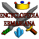 Simple pixel art, looks rough, but it combines the basic elements of Ermarian (Crown, Waveblade, Crystal - although the Sun emblem of Avernum is missing). By the Almighty Do-er of Stuff. Elaborate calligraphy. Not necessarily characteristic for the encyclopedia, but it's very elegant. By Gizmo. A portal. The writing is nice, but the drawing is a bit rough. By Dikiyoba. Simple, straight lines, and a sword. The writing is a bit small, though. By Andraste. While I was still trying to think of the official term for using an element of a picture to resemble text (because I wanted to point out how that didn't work here), I scrolled down and saw you had already gotten rid of it. Very nice, though Vahnatai-centric (bloody elitists). And he appears to be missing a mouth. By Alorael.  A mail-in submission. I really like this one, even though it is hardly related to Ermarian. Being abstract and having a white background really makes it blend in with the encyclopedia's skin. By The Great Mister. 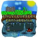 The cave is indeed awesome. It nicely shows the symmetry of Ermarian - two worlds, separated by tons of rock. By the Almighty Do-er of Stuff. --------------------------------------- It's not easy. I think I'll wait another week or so in case anyone else has anything (Riibu? You have no excuse.), and after that I'll make a poll to help me decide. :) Edit: In order to see how they look in context, I have set the logo to randomly rotate between the submissions so far. I realized that TGM's is without question the most professional. It looks smooth and regular, it blends into the page and still marks the encyclopedia as a unique site. But I'll wait for more proposals, and opinions. [ Friday, September 29, 2006 15:09: Message edited by: Robert Daniel Oliver ] -------------------- Encyclopaedia Ermariana • Forum Archives • Forum Statistics • RSS [Topic / Forum] My Blog • Polaris • I eat novels for breakfast. Polaris is dead, long live Polaris. Look on my works, ye mighty, and despair. Posts: 8752 | Registered: Wednesday, May 14 2003 07:00 |
|
Raven v. Writing Desk
Member # 261
|
written Friday, September 29 2006 15:13
Profile
Homepage
The other nice thing about the sun/cave pic is that ADOS has been extremely true to Exile colors. The blue-gray of the cave walls, and the green and brown of the surface dirt and grass, really do a good job of conjuring up the feel of E3 and BoE, despite being completely original. That alone sets it above the rest, IMHO. -------------------- Slarty vs. Desk • Desk vs. Slarty • Timeline of Ermarian • G4 Strategy Central Posts: 3560 | Registered: Wednesday, November 7 2001 08:00 |
|
Shaper
Member # 73
|
written Friday, September 29 2006 15:24
Profile
 Crystal moved, sun added. Maybe better? TGM's is certainly professional, but it's rather boring, isn't it? I think the logo should have some of the flavor of the games. I'm going to get to work making the white backgrounds transparent in my logos. EDIT: Done. EDIT 2: I'm thinking the burgundy is kind of hard to read. Should I change it to a different color? [ Friday, September 29, 2006 15:42: Message edited by: The Almighty Do-er of Stuff ] -------------------- My Myspace, with some of my audial and visual art The Lyceum - The Headquarters of the Blades designing community The Louvre - The Blades of Avernum graphics database Alexandria - The Blades of Exile Scenario database BoE Webring - Self explanatory Polaris - Free porn here Odd Todd - Fun for the unemployed (and everyone else too) They Might Be Giants - Four websites for one of the greatest bands in existance -------------------- 1 2 3 4 5 6 7 8 9 10 11 12 13 14 15 Posts: 2957 | Registered: Thursday, October 4 2001 07:00 |
|
Shaper
Member # 7420
|
written Friday, September 29 2006 15:44
Profile
Homepage
I'm very disapointed that Arancaytar didn't include me in his recap. Mostly because I wanted to see comments. -------------------- You lose. Posts: 2156 | Registered: Thursday, August 24 2006 07:00 |
|
Agent
Member # 4574
|
written Friday, September 29 2006 15:54
Profile
Emperor Tullegolar, It is my idea that you will need to change the spear so that they are not Es. Aran has recently stated this. Also, not required, change the vahnatai. -Goldenking P.S. I've found a unique way of posting, hooray! -------------------- Constitutional monarchies are the in monarchies. Posts: 1186 | Registered: Friday, June 18 2004 07:00 |
![[[Flower]]](http://encyclopedia.ermarian.net/w/skins/common/images/mediawiki.png)