Artwork request - Encyclopedia Logo
Pages
| Author | Topic: Artwork request - Encyclopedia Logo |
|---|---|
|
Law Bringer
Member # 2984
|
written Monday, October 2 2006 10:54
Profile
Homepage
quote:Personally, I think the golden/silver one looks better, but that's me. -------------------- Encyclopaedia Ermariana • Forum Archives • Forum Statistics • RSS [Topic / Forum] My Blog • Polaris • I eat novels for breakfast. Polaris is dead, long live Polaris. Look on my works, ye mighty, and despair. Posts: 8752 | Registered: Wednesday, May 14 2003 07:00 |
|
Agent
Member # 1934
|
written Monday, October 2 2006 13:34
Profile
Homepage
Thank you Drakey, for your undying support of people just trying to help out or have a little fun. The cave surface one is the best, I think. [ Monday, October 02, 2006 13:34: Message edited by: Andraste ] -------------------- You acquire an item: Radio Free Foil Posts: 1169 | Registered: Monday, September 23 2002 07:00 |
|
Shaper
Member # 73
|
written Monday, October 2 2006 16:37
Profile
 Please don't make me add a drop shadow. [ Monday, October 02, 2006 16:37: Message edited by: The Almighty Do-er of Stuff ] -------------------- My Myspace, with some of my audial and visual art The Lyceum - The Headquarters of the Blades designing community The Louvre - The Blades of Avernum graphics database Alexandria - The Blades of Exile Scenario database BoE Webring - Self explanatory Polaris - Free porn here Odd Todd - Fun for the unemployed (and everyone else too) They Might Be Giants - Four websites for one of the greatest bands in existance -------------------- 1 2 3 4 5 6 7 8 9 10 11 12 13 14 15 Posts: 2957 | Registered: Thursday, October 4 2001 07:00 |
|
Law Bringer
Member # 2984
|
written Monday, October 2 2006 17:07
Profile
Homepage
quote:But it's my favorite! :( ADoS: No drop shadow. The heavy lines wouldn't work together with that. But I like it. Also:  quote:Bad! No dissing Drakey's homepage, you don't want to be banned, do you! :P -- Okay. I'm going to prove Alec's point once more and find a way to stay neutral. Since the logo is pretty much decoration, not a means of corporate identity or advertisement, it doesn't matter what is up there, as long as it's something you like. I'm just short of adding an option to select your preferred logo and store the settings in a permanent cookie (unrelated to skins, because I'm not going to make 20 different skin sets). I'm comfortable with this mediawiki thing now, so adding that shouldn't be terribly difficult. On a per-artist level, to my slightly tired eyes it seems that everyone but ADOS and TGM are out of the competition. Or does anyone have a specific third artist whose logo should be in the final selection? This is for the credits and prize... -------------------- Encyclopaedia Ermariana • Forum Archives • Forum Statistics • RSS [Topic / Forum] My Blog • Polaris • I eat novels for breakfast. Polaris is dead, long live Polaris. Look on my works, ye mighty, and despair. Posts: 8752 | Registered: Wednesday, May 14 2003 07:00 |
|
Shaper
Member # 7420
|
written Monday, October 2 2006 17:40
Profile
Homepage
Looking at the two newest additions, I really like them both and would be happy with either, but I really wish you would take my advice and make the crown pointy. Bud... weis... er....  [ Monday, October 02, 2006 17:42: Message edited by: Emperor Tullegolar ] -------------------- You lose. Posts: 2156 | Registered: Thursday, August 24 2006 07:00 |
|
Agent
Member # 5814
|
written Monday, October 2 2006 18:24
Profile
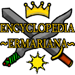
Okay, time to play hardball. The surface/cave picture by ADoS is both too detailed and too small to show much detail on the details. Too much detail is a bad thing because then you focus on the picture, when the text is your reason for visiting the Encyclopedia. The size of the detail is also a bad thing because despite the number of small details, none are clear and distinct. Play the lottery until you load up that picture on a page with lots of text, look closely at the picture, and you'll probably find yourself leaning closer to the screen. Finally, the number of colors used is very high. This slows down recognition of the picture. As for ADoS's crossed-weapons graphic with the outlining, it looks good (although I disagree with the tildes). However, it does not have the same impact as TGM's; subtle aspects, such as the handle of the waveblade and flat crown, look too unprofessional. It seems to me that either TGM's logo with a reversed "E" followed by a regular "E" or one of the plainer Sun-wearing-crown graphics would be best. Unlike the cave/surface picture, you don't focus on it for long; there's no hidden secrets to be found in them. And they have a sharpness which ADoS's crossed-swords series don't have. However, if we stop obsessing for two seconds about symbolism, I think that ef's submission should be considered. It doesn't have meaningful icons, but it does fit the part of an Encyclopedia logo. -------------------- quote: Posts: 1115 | Registered: Sunday, May 15 2005 07:00 |
|
Triad Mage
Member # 7
|
written Monday, October 2 2006 18:54
Profile
Homepage
quote:It looks fine to me. I don't have that problem. Once you look at it once you know what it is and then it just looks pretty and fits perfectly in the corner. The crossed swords look terrible and always have. TGM's crown and sun graphics are ... interesting. Some are okay and some are hideous, but none look right in context on the page. Ef's looks okay as a standalone, but it doesn't fit on the page correctly and looks out of place there too. -------------------- "At times discretion should be thrown aside, and with the foolish we should play the fool." - Menander ==== Drakefyre's Demesne - Happy Happy Joy Joy Encyclopedia Ermariana - Trapped in the Closet ==== You can take my Mac when you pry my cold, dead fingers off the mouse! Posts: 9436 | Registered: Wednesday, September 19 2001 07:00 |
|
Shaper
Member # 7420
|
written Monday, October 2 2006 19:01
Profile
Homepage
I concur. I am having a hard time imagining this scenario: "Oh, man, here I am trying to read up on the Second Slith War and my concentration keeps being broken by this colorful logo in the far upper left corner! It is so intrusive and... chromatic! Why did they put that thing there, why!?!?" Is this really a concern? -------------------- You lose. Posts: 2156 | Registered: Thursday, August 24 2006 07:00 |
|
Law Bringer
Member # 2984
|
written Monday, October 2 2006 19:22
Profile
Homepage
Well, what do you define as this "context" of the page, seeing as somehow the cave and surface seems to fit it and the sun and crown does not? -------------------- Encyclopaedia Ermariana • Forum Archives • Forum Statistics • RSS [Topic / Forum] My Blog • Polaris • I eat novels for breakfast. Polaris is dead, long live Polaris. Look on my works, ye mighty, and despair. Posts: 8752 | Registered: Wednesday, May 14 2003 07:00 |
|
Triad Mage
Member # 7
|
written Monday, October 2 2006 19:23
Profile
Homepage
With the rest of the MonoBook skin. -------------------- "At times discretion should be thrown aside, and with the foolish we should play the fool." - Menander ==== Drakefyre's Demesne - Happy Happy Joy Joy Encyclopedia Ermariana - Trapped in the Closet ==== You can take my Mac when you pry my cold, dead fingers off the mouse! Posts: 9436 | Registered: Wednesday, September 19 2001 07:00 |
|
Law Bringer
Member # 2984
|
written Monday, October 2 2006 19:28
Profile
Homepage
The Monobook skin consists of simple, straight lines and is entirely colorless. Take a look:   -------------------- Encyclopaedia Ermariana • Forum Archives • Forum Statistics • RSS [Topic / Forum] My Blog • Polaris • I eat novels for breakfast. Polaris is dead, long live Polaris. Look on my works, ye mighty, and despair. Posts: 8752 | Registered: Wednesday, May 14 2003 07:00 |
|
Law Bringer
Member # 335
|
written Monday, October 2 2006 19:47
Profile
Homepage
Seeing all of TGMs logos together makes them look hideous somehow. I still think all of them are at least okay and some of them are quite good. The crossed swords look better and better, and they have a certain inexplicable charm that captures the Spiderweb essence that TGM's offerings lack. And now the cave is losing its appeal for me. —Alorael, who can think of only one solution. Use the comb! Or at least take it off the list, you horrendous artistic sadist. Actual, for artistic sadism there are a few other offerings that are, alas, less than ideal and, with no names named, should be excised expeditiously. Posts: 14579 | Registered: Saturday, December 1 2001 08:00 |
|
Law Bringer
Member # 2984
|
written Monday, October 2 2006 19:59
Profile
Homepage
I put in the persistent cookie thing. You can now choose a logo right on the test page by clicking it to put it in the corner, then clicking the corner to go to the main page. Using that, I also replaced the above pages with screenshots of the main page, because the logo summary looks rather weird for a normal encyclopedia page. -------------------- Encyclopaedia Ermariana • Forum Archives • Forum Statistics • RSS [Topic / Forum] My Blog • Polaris • I eat novels for breakfast. Polaris is dead, long live Polaris. Look on my works, ye mighty, and despair. Posts: 8752 | Registered: Wednesday, May 14 2003 07:00 |
|
Triad Mage
Member # 7
|
written Monday, October 2 2006 20:07
Profile
Homepage
As impossible as it sounds, TGM's logo looks far too busy and the colors clash. Just because Monobook has straight lines and few colors doesn't mean it will go with everything. There's a reason you don't wear white after Labor Day. EDIT: Using persistent cookies I like how Alorael's first one looks (non-comb). EDIT 2: I just uploaded three adjusted versions of the cave to the encyclopedia:    The third has messed up transparency. Edit: Updated images to their new locations. [ Tuesday, October 03, 2006 20:59: Message edited by: Robert Daniel Oliver ] -------------------- "At times discretion should be thrown aside, and with the foolish we should play the fool." - Menander ==== Drakefyre's Demesne - Happy Happy Joy Joy Encyclopedia Ermariana - Trapped in the Closet ==== You can take my Mac when you pry my cold, dead fingers off the mouse! Posts: 9436 | Registered: Wednesday, September 19 2001 07:00 |
|
Law Bringer
Member # 335
|
written Monday, October 2 2006 20:26
Profile
Homepage
As opposed to which second one? [Edit: Choose words carefully. Be aware of audience. Evil, evil audience.] —Alorael, who would be even happier with a way to choose his own random lineup by excluding some entries. Like, oh, combs. And many redundant drafts. Aran, you know what you must do! [ Monday, October 02, 2006 20:30: Message edited by: Days of Our Palimpsests ] Posts: 14579 | Registered: Saturday, December 1 2001 08:00 |
|
Lifecrafter
Member # 6388
|
written Monday, October 2 2006 21:16
Profile
Yeah, now I'm beginning to see the salience of Aran's objection to ADoS's logo. It just clashes with the rest of the layout for some reason. TGM's newest, on the other hand, looks stunning. Posts: 794 | Registered: Tuesday, October 11 2005 07:00 |
|
? Man, ? Amazing
Member # 5755
|
written Monday, October 2 2006 22:23
Profile
Use the comb already! I mean really, must I be the only cheerleader for the inane? Edit - As Tyranicus is aiming for the "most double postings in a month" award, I'll just add this. Rhetorical, you nitwits. [ Monday, October 02, 2006 22:25: Message edited by: Jumpin' Salmon ] -------------------- quote: Posts: 4114 | Registered: Monday, April 25 2005 07:00 |
|
Law Bringer
Member # 2984
|
written Monday, October 2 2006 22:39
Profile
Homepage
quote:Ceterum Censeo, huh? At this rate of persistence, I'm wondering why you haven't yet got a custom title. :P I've taken off your pictures that used the "comb" for letters. If you want the rest gone too, just clarify. :) Drakefyre: The logo candidates are not in the encyclopedia article database itself - nor will the final logo be. I am adding all logos to the selection by uploading them to the special folder - meanwhile, you could upload them to any other space, like stuff.ermarian.net I've placed your uploads into the selection folder (under ADoS name, since they're edits from his) and taken them off the Encyclopedia's internal image gallery; that one is only for images used in entries and templates. Edit: Now it is, TGM. [ Tuesday, October 03, 2006 02:18: Message edited by: Robert Daniel Oliver ] -------------------- Encyclopaedia Ermariana • Forum Archives • Forum Statistics • RSS [Topic / Forum] My Blog • Polaris • I eat novels for breakfast. Polaris is dead, long live Polaris. Look on my works, ye mighty, and despair. Posts: 8752 | Registered: Wednesday, May 14 2003 07:00 |
|
Warrior
Member # 7254
|
written Tuesday, October 3 2006 01:58
Profile
Homepage
why's the wheelchair-one not up there with the rest!? :( Posts: 73 | Registered: Monday, June 26 2006 07:00 |
|
Shaper
Member # 73
|
written Tuesday, October 3 2006 07:14
Profile
Either the crown is flat, or the crown is round. It cannot be both. I do think the handle needs work, though. Aran, does this mean nobody wins? [ Tuesday, October 03, 2006 07:16: Message edited by: The Almighty Do-er of Stuff ] -------------------- My Myspace, with some of my audial and visual art The Lyceum - The Headquarters of the Blades designing community The Louvre - The Blades of Avernum graphics database Alexandria - The Blades of Exile Scenario database BoE Webring - Self explanatory Polaris - Free porn here Odd Todd - Fun for the unemployed (and everyone else too) They Might Be Giants - Four websites for one of the greatest bands in existance -------------------- 1 2 3 4 5 6 7 8 9 10 11 12 13 14 15 Posts: 2957 | Registered: Thursday, October 4 2001 07:00 |
|
Law Bringer
Member # 2984
|
written Tuesday, October 3 2006 07:42
Profile
Homepage
No, it just means several people win. You and TGM are among them. Unless I hear a few other calls or somebody designs a really good logo in the next week or so, nobody else is. This means you both (and whoever else might still be included) get credited on the Encyclopedia site (I still have to determine where, exactly; probably a link to a Meta page "Credits" next to the Disclaimer link near the top of the main page), and, if you want, the webspace/email address thing. As for Gmail, I know TGM has it, but I'm not sure about you, ADoS. Edit: A small problem with cookie paths caused the setting to be ignored on pages with /w/index.php? instead of /wiki/. Fixed. If your setting appears not to work, set it again. [ Tuesday, October 03, 2006 09:52: Message edited by: Robert Daniel Oliver ] -------------------- Encyclopaedia Ermariana • Forum Archives • Forum Statistics • RSS [Topic / Forum] My Blog • Polaris • I eat novels for breakfast. Polaris is dead, long live Polaris. Look on my works, ye mighty, and despair. Posts: 8752 | Registered: Wednesday, May 14 2003 07:00 |
|
Shaper
Member # 73
|
written Tuesday, October 3 2006 12:18
Profile
Hooray! *sets Alorael's logo, which should stay* Yes, I have Gmail. How much webspace are we talking, here? [ Tuesday, October 03, 2006 12:19: Message edited by: The Almighty Do-er of Stuff ] -------------------- My Myspace, with some of my audial and visual art The Lyceum - The Headquarters of the Blades designing community The Louvre - The Blades of Avernum graphics database Alexandria - The Blades of Exile Scenario database BoE Webring - Self explanatory Polaris - Free porn here Odd Todd - Fun for the unemployed (and everyone else too) They Might Be Giants - Four websites for one of the greatest bands in existance -------------------- 1 2 3 4 5 6 7 8 9 10 11 12 13 14 15 Posts: 2957 | Registered: Thursday, October 4 2001 07:00 |
|
Shaper
Member # 7420
|
written Tuesday, October 3 2006 12:24
Profile
Homepage
Hmm. *sets his own logo then lies about it* I'm with the cave logo all the way. -------------------- You lose. Posts: 2156 | Registered: Thursday, August 24 2006 07:00 |
|
Law Bringer
Member # 2984
|
written Tuesday, October 3 2006 14:04
Profile
Homepage
ADoS: Between 250 to 300 MB? At present, it's quite flexible because I have a lot free. -------------------- Encyclopaedia Ermariana • Forum Archives • Forum Statistics • RSS [Topic / Forum] My Blog • Polaris • I eat novels for breakfast. Polaris is dead, long live Polaris. Look on my works, ye mighty, and despair. Posts: 8752 | Registered: Wednesday, May 14 2003 07:00 |
|
Shaper
Member # 73
|
written Tuesday, October 3 2006 15:00
Profile
What about bandwidth? -------------------- My Myspace, with some of my audial and visual art The Lyceum - The Headquarters of the Blades designing community The Louvre - The Blades of Avernum graphics database Alexandria - The Blades of Exile Scenario database BoE Webring - Self explanatory Polaris - Free porn here Odd Todd - Fun for the unemployed (and everyone else too) They Might Be Giants - Four websites for one of the greatest bands in existance -------------------- 1 2 3 4 5 6 7 8 9 10 11 12 13 14 15 Posts: 2957 | Registered: Thursday, October 4 2001 07:00 |